Work
About
Work
About
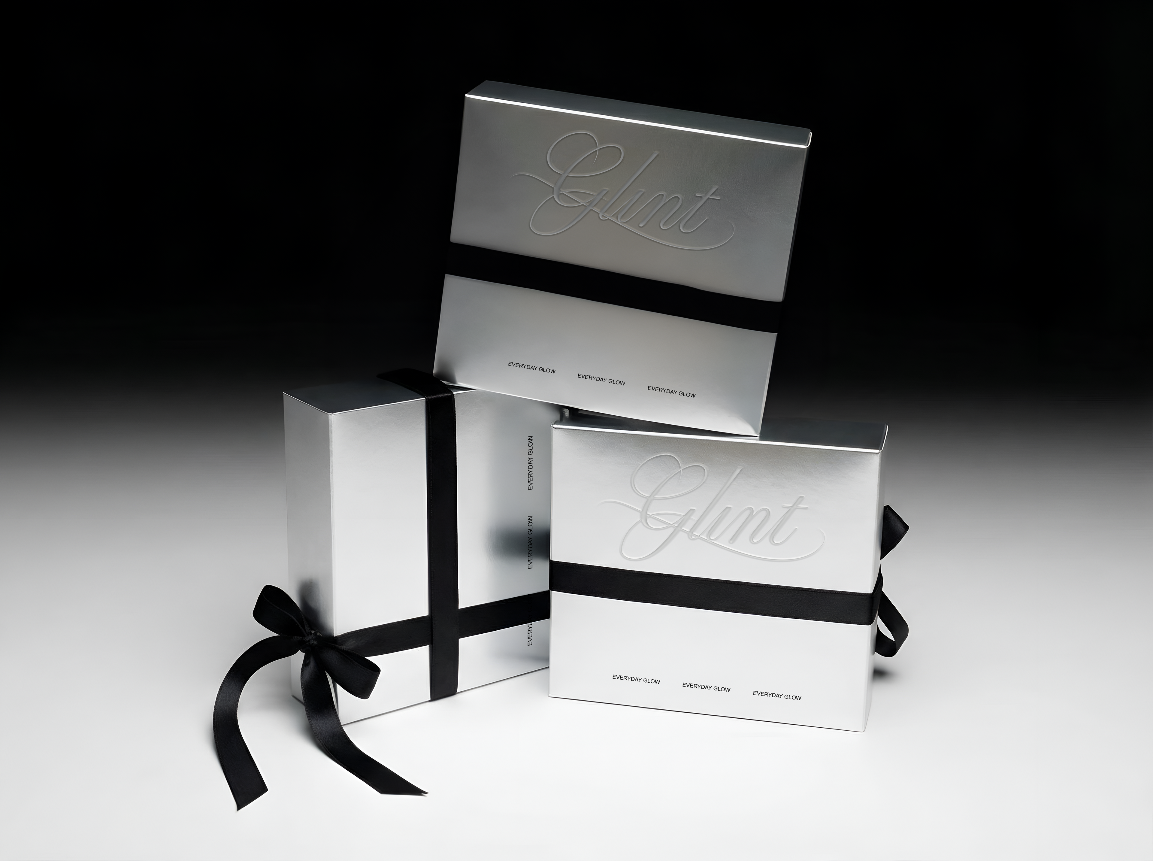
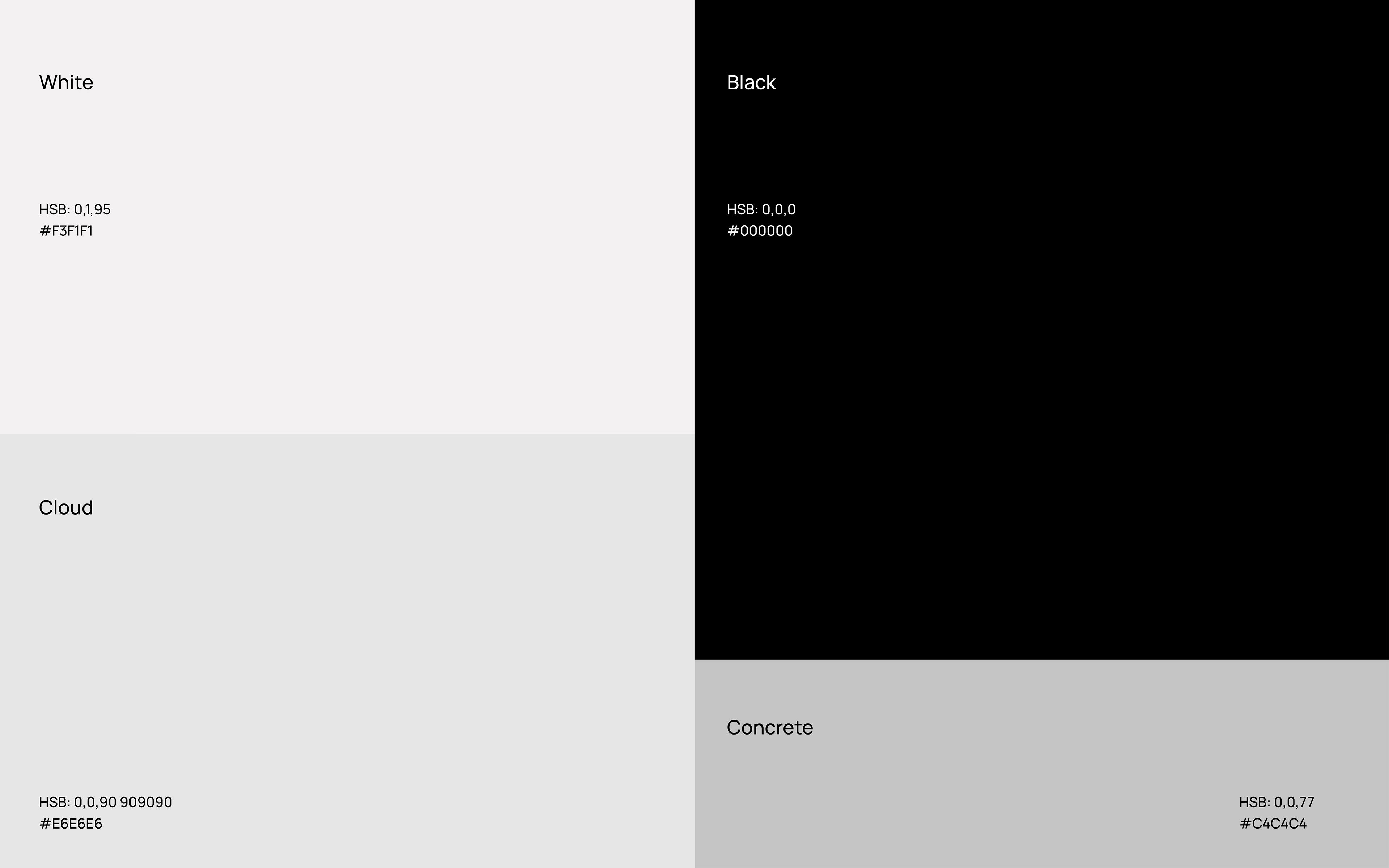
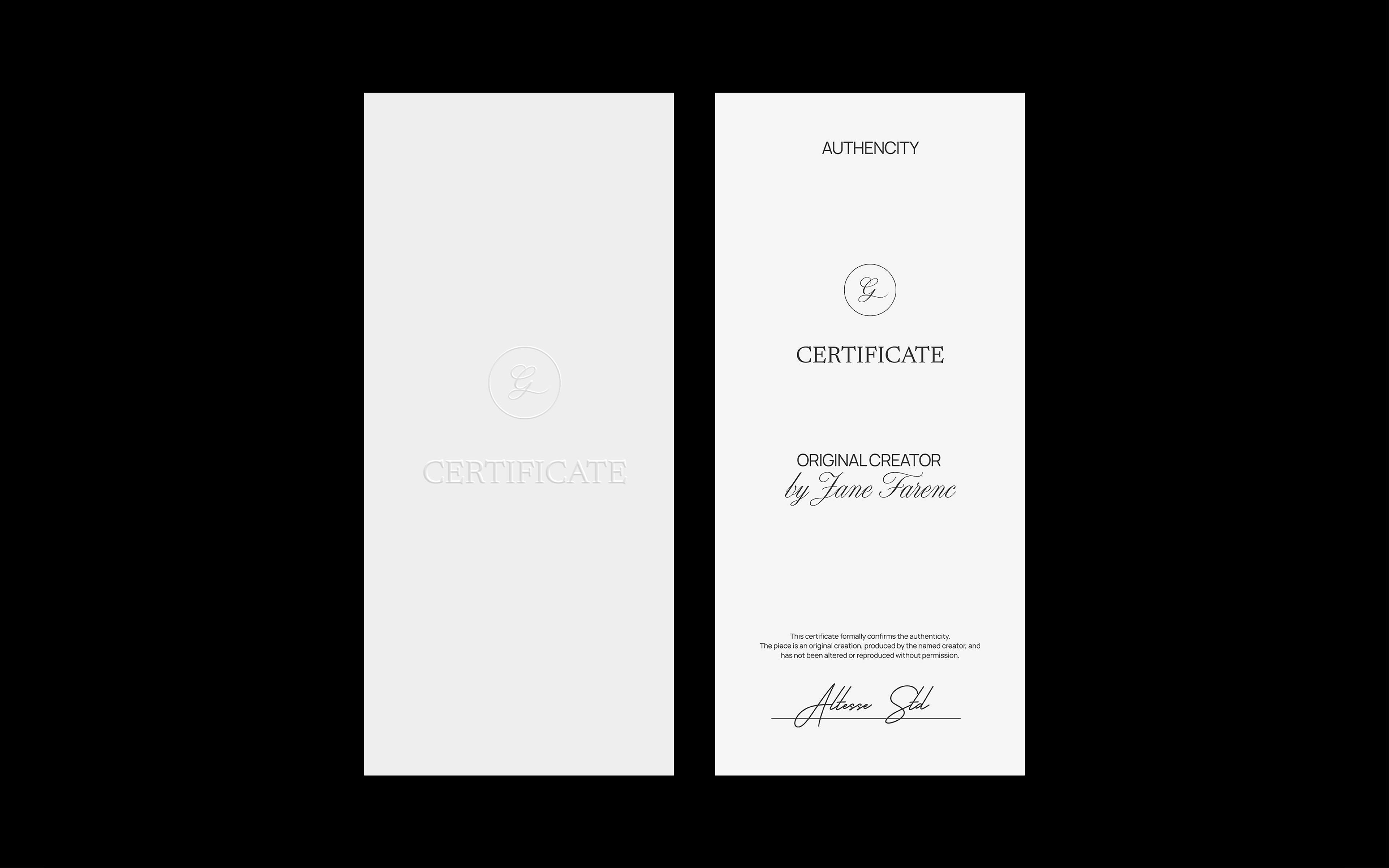
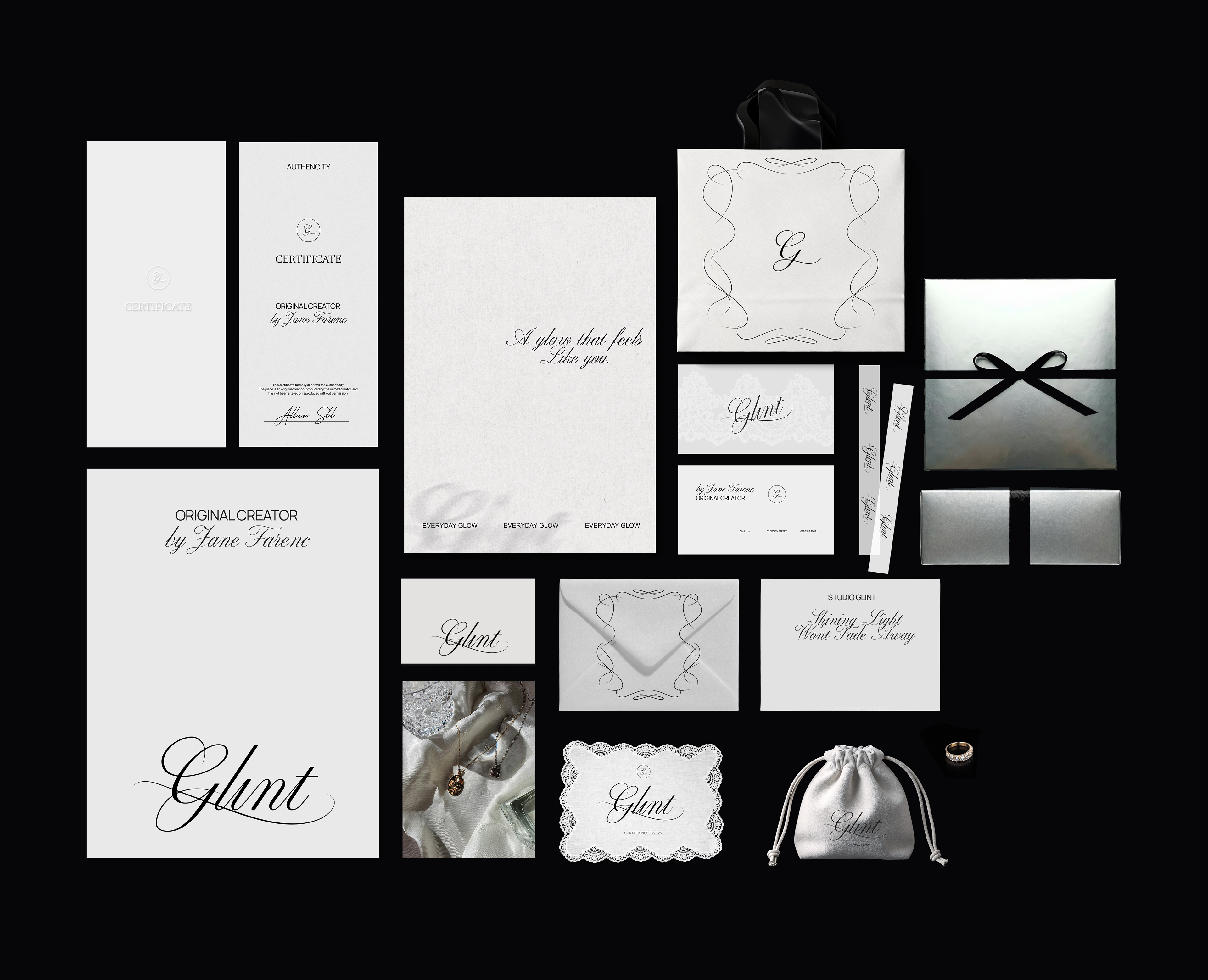
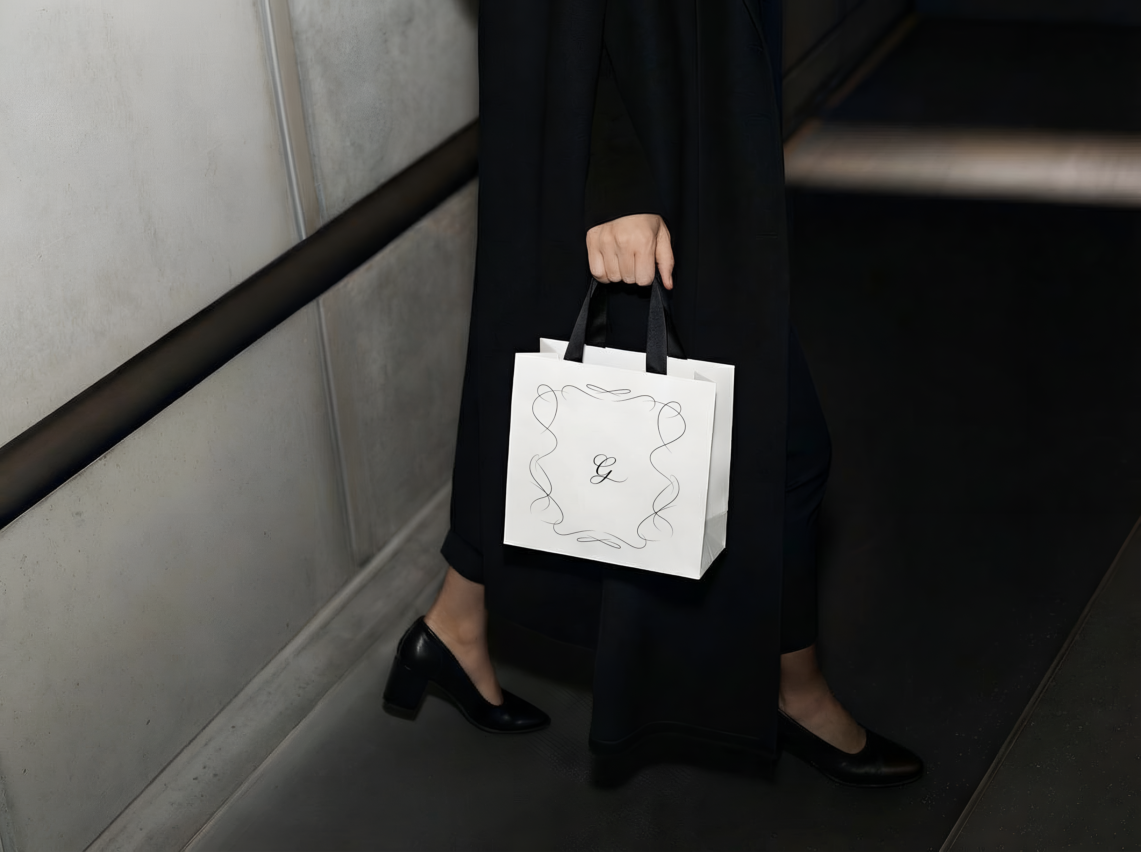
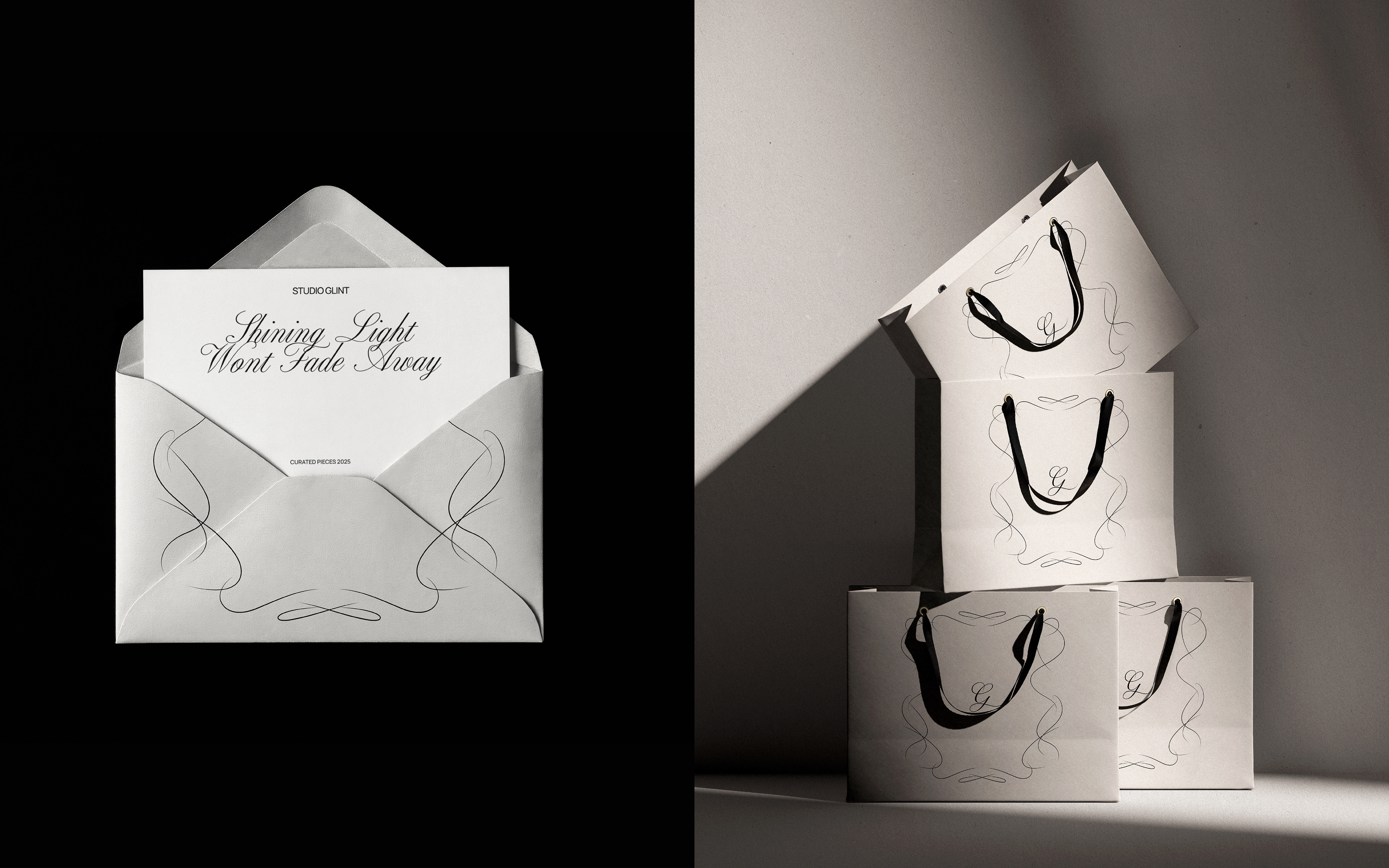
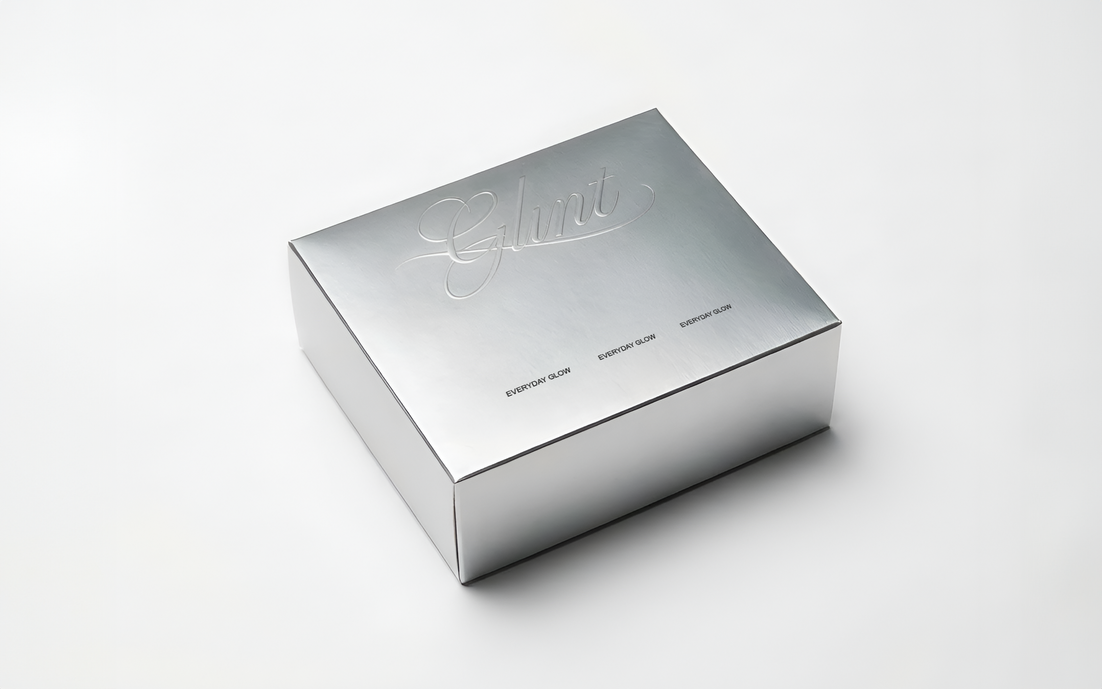
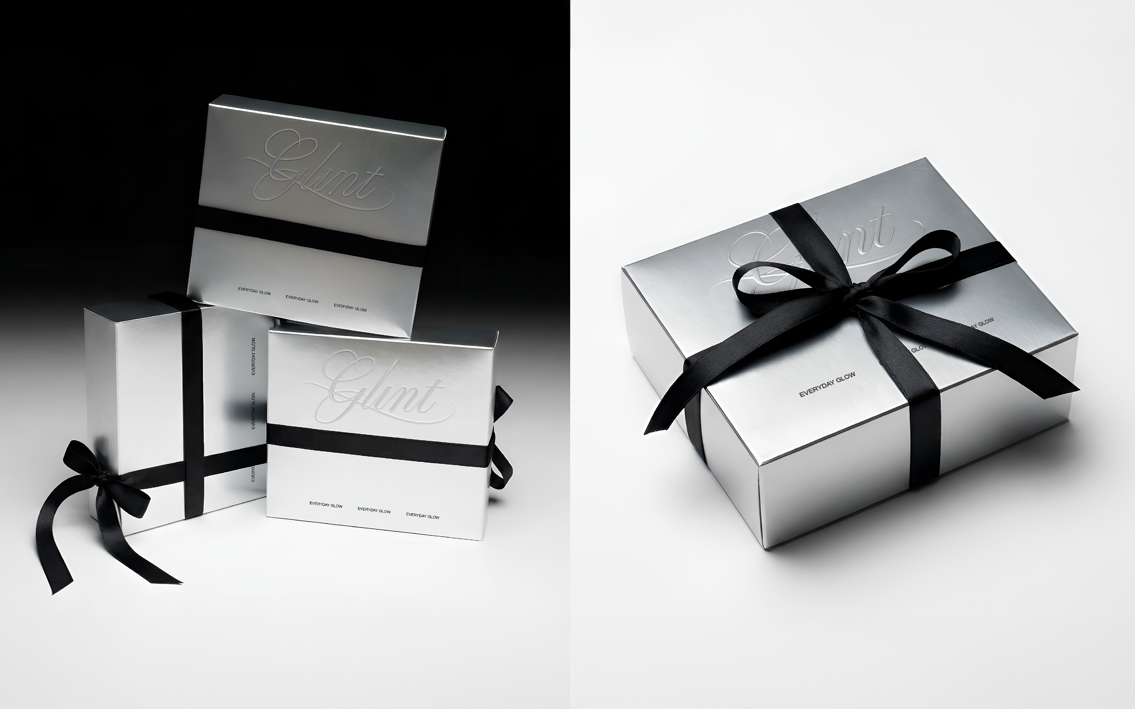
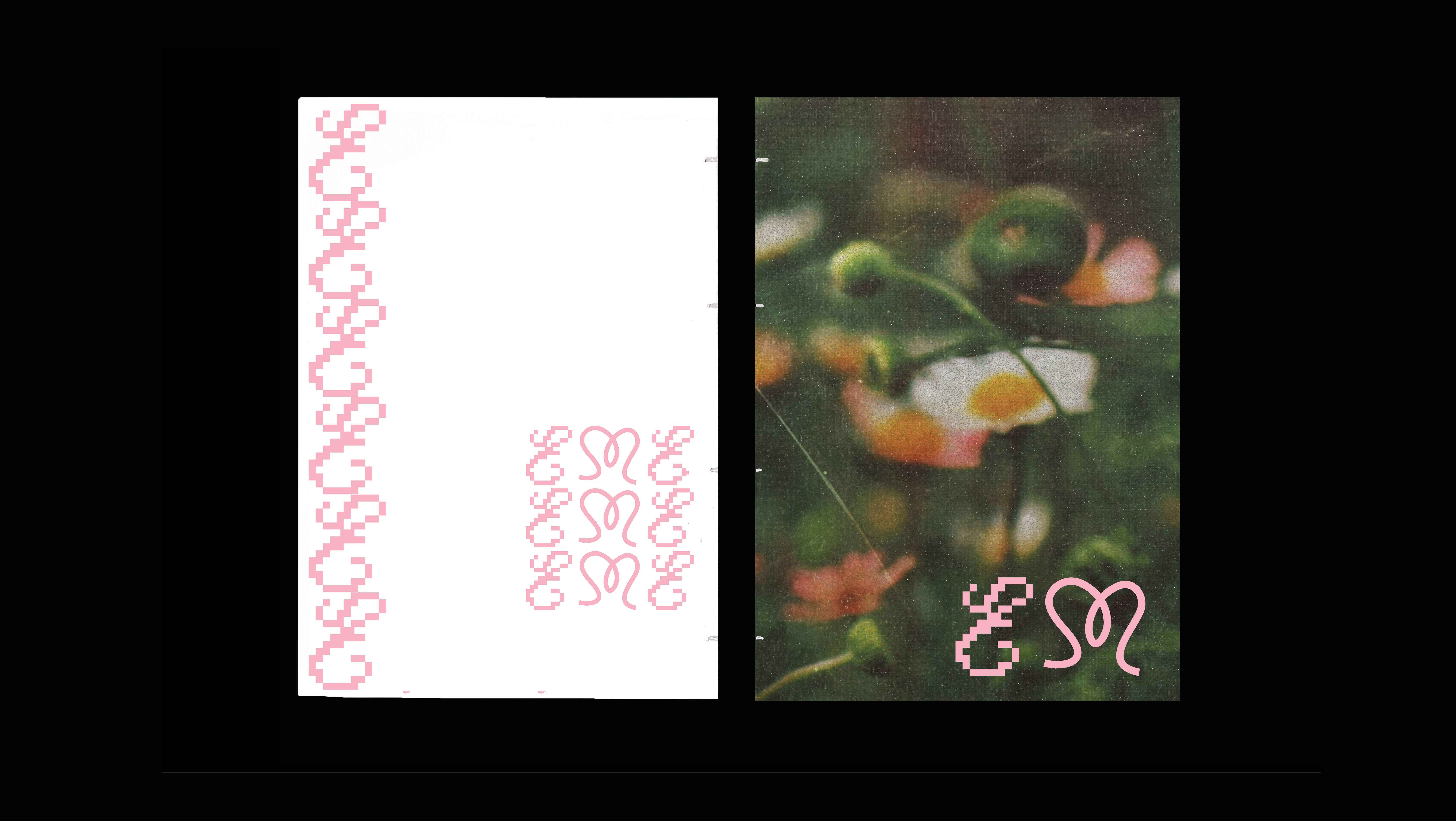
Branding project by Mariia Volosozhar
Contact info //
LinkedIn
m.volzar.20@gmail.com
You may also like
Elvis Shakespeare
2023
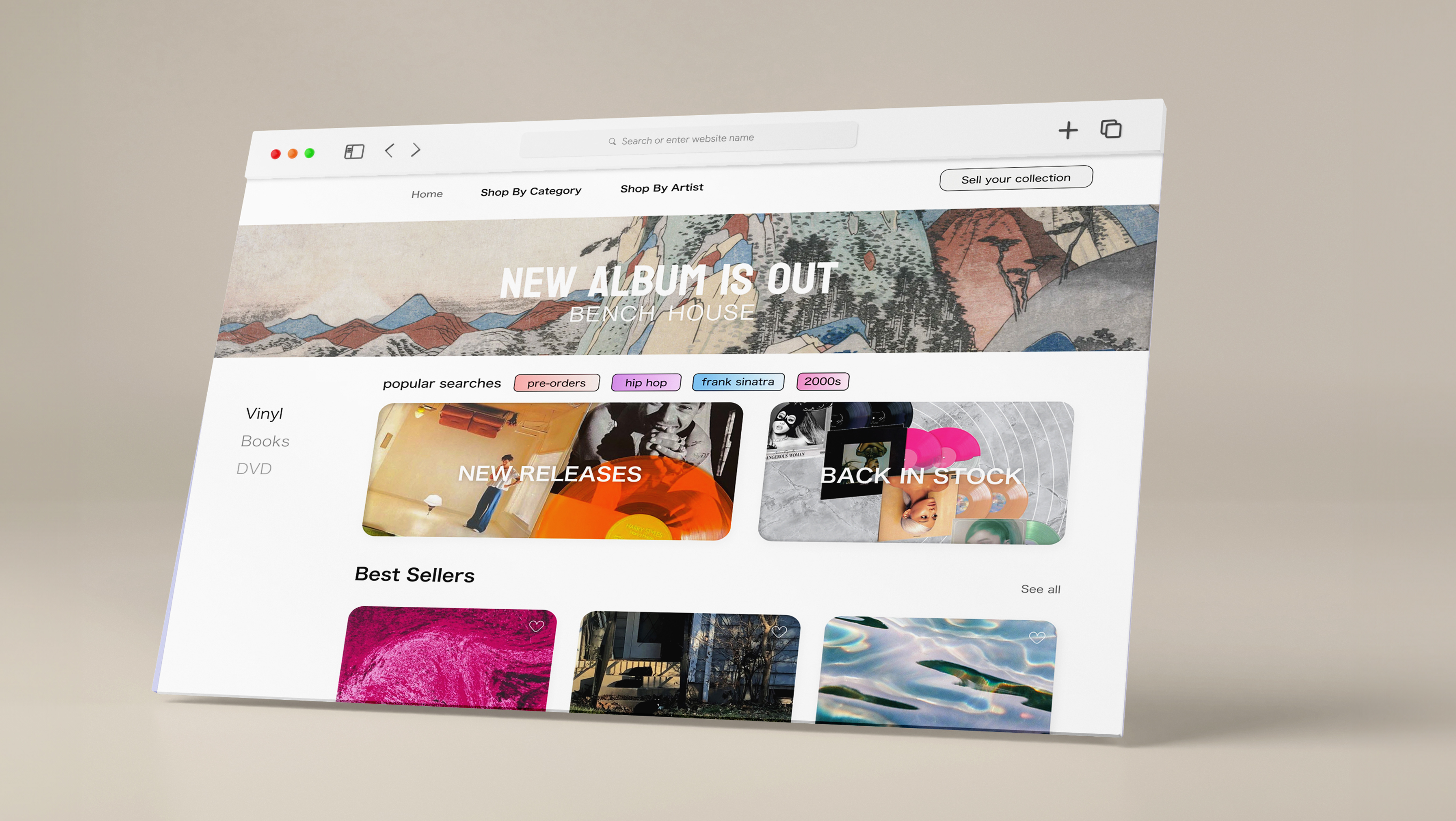
ECOSYSTEMS - MAGAZINE
2026
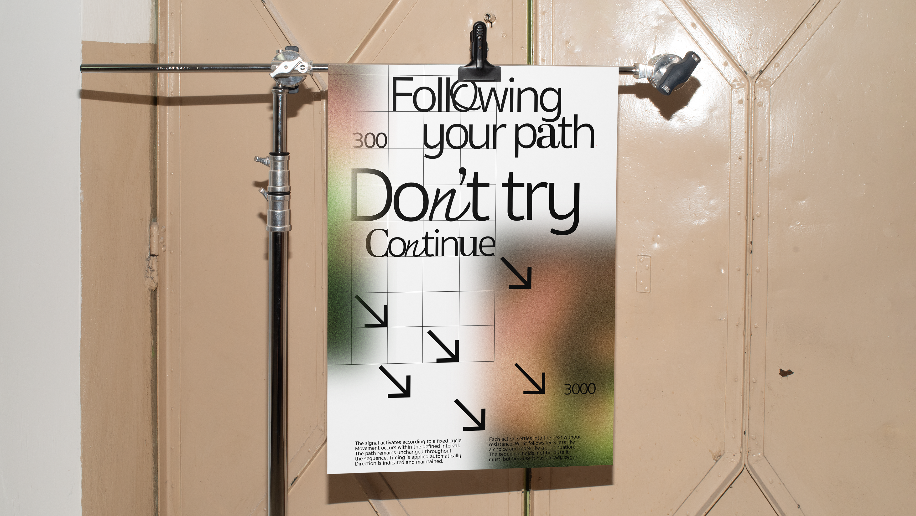
posters
2026
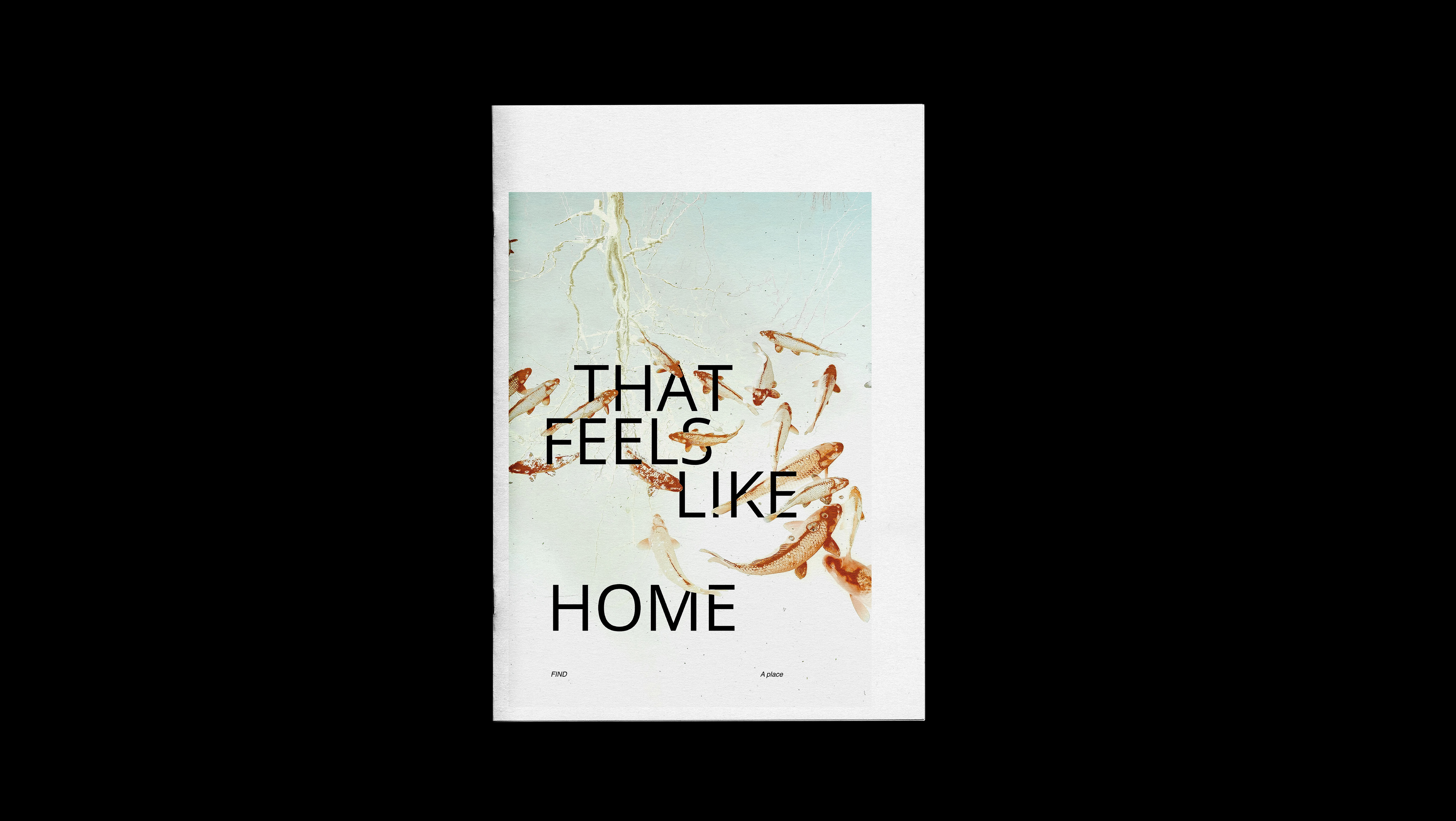
Feels Like Home
2025
↑
Back to Top